
- What are tables and graphs?
- Why do we want students to know about tables and graphs?
- What are the problem areas for students?
- Variables – what are they?
- Constructing tables
- Constructing graphs
- Interpreting tables and graphs
- Implications for teaching
- Possible progressions in teaching about graphs
- References
| This resource is intended for teachers to use for their own professional development |
What are tables and graphs?
Tables and graphs are visual representations. They are used to organise information to show patterns and relationships. A graph shows this information by representing it as a shape. Researchers and scientists often use tables and graphs to report findings from their research. In newspapers, magazine articles, and on television they are often used to support an argument or point of view.
Why do we want students to know about tables and graphs?
Tables and graphs can be useful tools for helping people make decisions. However, they only provide part of a story. Inferences often have to be made from the data shown. As well as being able to identify clearly what the graph or table is telling us, it is important to identify what parts of the story are missing. This can help the reader decide what other information they need, or whether the argument should be rejected because the supporting evidence is suspect. Students need to know how to critique the data and the way it is presented. A table or graph can misrepresent information by
- leaving out important information. Student absences gives an example of a graph with missing features.
- constructing it in such a way that it misrepresents relationships. This may be because of poor skills, or it may be done deliberately to bolster a particular argument, for example using 2-dimensional shapes to inflate apparent growth. See Newspaper stories for examples of misleading graphs.
It is easy, if students are not skilful at reading graphs and tables, to interpret them incorrectly. They can make wrong decisions because they are basing them on false inferences. When constructing graphs and tables, it is also possible to misrepresent the data. Research suggests that students often regard tables and graphs as an end in themselves. Few refer to them as a source of evidence, or as a way of exploring patterns and relationships in data or information.
The curriculum
Tables and graphs are relevant to almost all areas of the curriculum. The conventions of tables and graphs are consistent across all curricula. It is the context in which they are used that identifies them as science, social sciences, geography, etc. The table below gives examples of English, mathematics, and science ARB resources that include tables or graphs.
Examples from the Assessment Resource Banks
| Tables | Graphs |
|
English Construct a graph to show trends in a character's emotions related to a particular event: Cuthbert’s Babies. |
|
|
Mathematics Complete a table to show the amount of staff members' Christmas bonus, then use this to calculate how much money is left over: $200 bonus. |
Mathematics Complete and use a table to graph the cost per hour of repairing a car: Car maintenance. |
|
Science Complete a table about properties of paper towels: The best mopper upper. |
Science Interpret a graph of a car's journey and add to the graph to represent a further description of the journey: A car journey. |
Key competencies
Investigating tables and graphs potentially strengthens several key competencies.
- Using language, symbols, and texts: Knowing about graphs and tables strengthens students' ability to access and critique others' ideas. It also helps them to effectively communicate their own. The statement that students' "confidently use ICT" (p. 12) reinforces the role assistive technology has for tables and graphs. This should include organising, analysing, and making sense of information as well as being able to "access and provide information and to communicate with others" (Ministry of Education, 2007, p. 12).
- Participating and contributing: Interpreting and critiquing sometimes conflicting data is a necessary skill for making decisions. Tables and graphs are a useful tool for organising available data for decision making. They are also a useful way of providing evidence to convince others towards a particular argument.
- Thinking: Analysing and synthesising data from various sources is an important part of developing arguments and decision making.
What are the problem areas for students?
The National Education Monitoring Project (NEMP) identified two relevant sets of skills
- extracting and interpreting information
- constructing or completing graphs and tables.
NEMP (2003) reported that many New Zealand students
- did not give their graphs and tables an appropriate title
- did not label the axes appropriately
- had difficulty with working with more than one variable at a time, i.e. comparing, calculating, and working with multiple sources.
Trials of ARB resources have identified further areas of difficulty for students.
Language
Some technical vocabulary can cause problems for some students.
- A table is sometimes called a chart. This is a correct use, but can confuse students.
Some students are only familiar with the everyday meaning of table. These students draw a kitchen table when asked to "draw a table". Go to Language barriers.
- In mathematics and science the term range is often used to refer to a single number whereas in everyday situations we tend to use the word "range" to refer to the set of numbers between a lower and upper limit. For example in the question "What is the range of temperature fluctuations shown in this place?" the correct answer would be 14 °C if range is interpreted in a mathematical sense and 35°C to 49°C if range is interpreted in an every day context. Mathematics also refers to the y-axis of a graph as the range (the x-axis is called the domain).
Tables
In our ARB trials we have found that most students can complete simple table-reading tasks. Students have had difficulty with:
- constructing more complex tables, e.g. two-way tables
- transforming data from texts
- interpolating and extrapolating information
- answering questions that involve calculations.
Other areas that are challenging for students are:
However, many students also do not complete these sorts of tasks well in contexts other than tables. Organising the information into a table is a helpful strategy for assisting students to develop these skills. |
Graphs
In our ARB trials we have found students may have difficulty with
- selecting an appropriate graph to communicate their findings
- providing a title for the graph
- naming the axes
- reading the scale of the axes, and relating them to the shape of or trends in the graph
- deciding on the appropriate scale to use when constructing graphs
- marking sub-units on the axes at regular intervals (although occasionally marking at irregular intervals may be acceptable)
- including the units of measure (plus any multipliers) on each axis of a graph
- answering questions that involve calculations
- plotting information from an article/ written text
- identifying trends, explaining or synthesising relationships between two graphs, or two or more variables
- reading the overall shape or trend of a graph
-
interpreting time/distance graphs. They read or construct them as a picture of what happened, for example
interpreting when the line goes up as going uphill
going back to the starting point to reach "home".
At Year 4 most students can read the information on a simple graph. Pie graphs may be more difficult than bar or line graphs. At Year 8 many students can extrapolate information from a simple line graph. At Year 10 most students are reasonably successful at converting a straight-forward table to a graph.
|
When making decisions about students' interpretation of graphs, it is important to also consider their familiarity with the context. Lack of knowledge about the context may affect their ability to interpret the graph. |
Variables – what are they?
In graphs and tables the components that are being compared or measured are called variables. For example, if the question is: How does shadow length vary during a day? The length of the shadow is one variable, and the time of day is the other. It is often useful to describe variables as either dependent or independent. The dependent variables are what can be seen to be changing in relation to the particular levels of the independent variables. In the above example
- the independent variable is the time of day
- the length of the shadow is the dependent variable as it depends upon the time of day.
In many instances, however, there is no obvious connection of this type between the variables. In other situations we are interested in how the many variables interact with each other. There are 4 main types of variables:
- categoric variable – described by a word label, not a number, e.g., different brands of paper towel
- ordered variable – categoric variables that can be put in order, e.g., cool, warm, hot
- discrete variable – described by whole numbers only, e.g., 1, 2, 3 teaspoons
- continuous variable – described by any number or part number, e.g., 35.5°.
An investigation can have any combination of variables. This is defined by the question. Variables which are subject to some sort of random, statistical errors are known as random variables. Most variables in real investigations are of this type (and are usually just referred to as variables).
Constructing tables
Tables are
- an organiser for an investigation
- a way of presenting data in a report
- an organiser to assist comprehension and thinking.
Purposes
For investigations with no numerical data it is usually better to use a table to present the data. A table with numerous variables can be broken down into smaller tables that look at each variable separately. The interaction between the various variables can then be explored.
Structure
- The independent variables (if they have been identified) go in the left hand columns, the dependent variables on the right.
| The independent variable → | Type of paper towel | Amount of water absorbed (ml) | ← The dependent variable |
- Any column heading should have all the information needed to define the table's meaning. A categoric variable should include a description of the class. A discrete or continuous variable should identify units and any multipliers (e.g., hundreds of people, millions of dollars, kilometres).
- A title summarises what the table is showing.
- When investigating, the order of the entries is arbitrary. When reporting results, they should be sorted into an order.
- Sometimes it is better to put data into bands, e.g., < 10 years, 10-15 years, 16-20 years… this makes it more manageable, and easier to see trends and patterns.
- A table helps organise information so it is easier to see patterns and relationships.
- If a variable is continuous the table reveals a lot more information. It may show the range, interval, and number of readings.
- Tables with multiple variables can provide a lot of information. They can be read by selecting and controlling factors to search for patterns in the data.
Limitations
- It can be difficult to see numerical relationships and patterns. A graph may make these clearer.
- When clumping information into bands, there is no indication of how many are in each category.
Constructing graphs
Purposes
Graphs are
- a way of exploring the relationships in data
- a way of displaying and reporting data, making it easier to report patterns and relationships, shapes of distributions, and trends.
Structure
Any graph used to report findings should show
- the significant features and findings of the investigation in a fair and easily read way
- the underlying structure of an investigation in terms of the relationships between and within the variables
- the units of measurement
- the number of readings (though sometimes these will be in the accompanying text)
- the range and interval of readings, where appropriate.
It is good practice (but only a convention) to put the dependent variable on the horizontal (x) axis and the independent on the vertical (y) axis.
Bar graphs
Bar graphs should be used for categoric, ordered, and discrete variables. If the number of units in a discrete variable is large it may be displayed as a continuous variable.
Line graphs
Line graphs should be used for continuous variables.
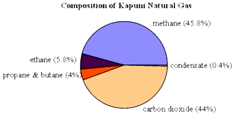
Pie graphs
Pie graphs (sometimes called pie or circle charts) are used to show the parts that make up a whole. They can be useful for comparing the size of relative parts. Because it is difficult to compare different circle graphs, and often hard to compare the angles of different sectors of the pie, it is sometimes better to choose other sorts of graphs.
|
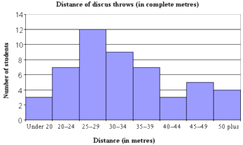
Histograms Use histograms when y-axis gives the frequency of, or occurrences for continuous data that has been sorted into groups, for example, 20-24 metres. All bars are usually of equal width. They can be turned into line graphs by connecting the middle of the top section of each vertical bar. Histograms are not joined up bar graphs and should not be used for categoric data (unless the number of units in each group is large). |
 |
What a graph can tell you
On a graph you get an overall shape of a variable or the relationships between variables. A line graph represents a numerical or mathematical relationship and so has more information "buried" in it than other graphs. Line graphs can sometimes be used to make predictions for values that were not measured, by interpolating or extrapolating the trend, or by looking at the shape.
Limitations:
- Graphs can tell you a lot about the design of an investigation, but they don't tell you everything. For example, they don't usually tell you which variables were controlled, the sample size, or the method of measurement. So there are lots of questions to ask to find out about validity and reliability, and also about the actual context of the investigation.
- The scales on the axes can be stretched or shrunk to emphasise one side of a relationship or to make a point that may not be justified by the data.
- A graph implies a relationship but not necessarily a cause. For example, a graph may show that houses cost less in March than they did in February, but it does not show why this happened. We may infer it is because the interest rates have gone up.
Interpreting tables and graphs
Gott and Duggan identified layers of complexity to reading, interpreting, and analysing data shown in tables and graphs. These include
- reading off particular data from points on the table or graph (easy)
- selecting sections of relevant data from complex data sets (more complex)
- identifying and interpreting patterns within different types of data (most complex).
A study of 12 and 14 year olds found that individual students noticed the patterns of line graphs in different ways. Their responses were grouped into five categories.
How students interpreted line graphs:
| Category | Description | Example of student response |
| No pattern | - | - |
| Numerical patterns | Identified numerical patterns generated from one or both axes. These were irrelevant to the graphs' "messages". Some students were distracted from generalising about the relationships by obvious numerical patterns. | The numbers if put in order go even, odd, odd, even and so on. |
| Graphical patterns | Described the shape or direction of the line. These students did not relate this shape to what the axes represented. | It goes down and then back up. |
| Unrelated trends in variable | Described a general trend in the separate variables but did not relate these to one another, or described a trend in one variable but not the other. | The length of the shadow decreased. |
| Generalised relationships between variables | Were able to generalise a relationship between dependant and independent variables. Prior experience of the context appeared to be a factor in being able to make generalisations. | The higher the ball was dropped from the higher it bounced back. |
Key questions to ask
The questions below
- assist students to critique their own and others' tables and graphs
- provide useful teaching points for teachers as they plan for next learning
Teachers need to consider the age of their students and reword at an appropriate level.
|
Questions
Adapted from Gott and Duggan (2003)
|
Implications for teaching
Construction
- Teach not only the agreed conventions, but also the reasons for these.
- Students are more likely to include titles and name the axes if they understand their purpose.
- Support students to think about the most appropriate type of table or graph to present their data.
- Assist students to select an appropriate scale for their data.
- Younger students may benefit from physically representing data with props, including themselves.
- Interactive whiteboards, Excel spreadsheets, graphic calculators and other forms of ICT have been used successfully by some teachers for developing skills in constructing graphs. Some computer programmes can be used to generate graphs. Discussion is an important part of using these props and tools.
- Develop the vocabulary to describe parts of tables and graphs.
Interpretation
- Assist students to investigate the story the table or graph tells.
- Give students practice in investigating the relationships presented in tables and graphs, and making inferences from them.
- Teach students to break a graph into sections, read separately, and then reconstruct to tell the story.
- Encourage students to decide what other information they need to know before they can make decisions based on the data represented.
- Develop vocabulary that describes and compares.
Possible progressions in teaching about graphs
Progressions in constructing and interpreting graphs should be used with caution. Students' skill levels are likely to be influenced by
- their familiarity with the context they are working in
- the complexity of the context they are working in
- the complexity of the data
- the complexity of the construction of the graph.
The following chart does, though, provide some useful guidelines.
| Construction | Interpretation | |
| 1. |
With support:
|
Read data from marked points Describe a pattern shown on the graph |
| 2. |
Independently:
|
Read data from any points Describe a relationship represented in the graph Recognise and give a simple explanation for an inconsistency in the data shown on the graph |
| 3. |
With support, select appropriate graph and scale Plot two (or more) sets of data on the same axis. |
Describe relationships between variables, including dependent and independent if relevant Identify and explain anomalous results Interpret information from a graph Infer unknown values by using the shape of the graph to predict a continuing pattern With support, use the patterns on a graph as evidence. |
| 4. |
Select appropriate graph and scale Know when and how to draw a line of best fit. Independently construct a range of more complex graphs |
Make inferences and predictions from graphs, and justify Reach conclusions consistent with graphical evidence. Use patterns and relationships represented on graphs to make judgements Critique others' interpretations of graphs by evaluating the information shown in a graph and how it is represented. |
References
- Austin, R., Holding, B., Bell, J. and Daniels, S. (n.d.). Assessment Matters: No.7. Patterns and Relationships in School Science. London: SEAC.
- Flockton, L., Crooks, T, and Gilmore, A. (2004). Graphs, Tables and Maps: Assessment Results 2003. Dunedin: Educational Research Unit, University of Otago.
- Goldsworthy, A. (2004). Acquiring scientific skills (see especially pages 40-49). In Sharp, J. (ed.) (2004). Developing primary science. Exeter: Learning Matters. Retrieved 10 May 2008, from http://www.learningmatters.co.uk/sampleChapters/pdfs/DPS03.pdf
- Gott, R. and Duggan, S. (2003). Understanding and Using Scientific Evidence: How to Critically Evaluate Data. London: SAGE Publications.
- Ministry of Education (2007). The New Zealand Curriculum. Wellington: Learning Media.