
This task is about constructing and then reading information from a graph.
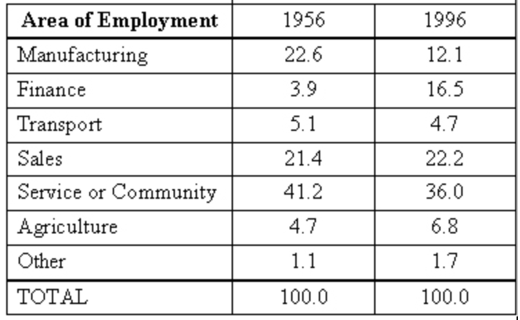
The table shows the number of people working in different areas of employment, in 1956 and 1996, as a percentage of all people in the workforce for each of these years.
| a) |
Graph this data as a composite bar graph on the grid below.
|
|
Percentage of People in Different Area of Employment in 1956 and 1996
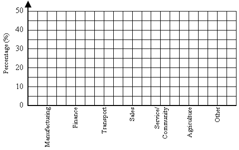 Area of Employment |
|
| b) |
Between 1956 and 1996, which area of employment had:
|
|
i) the largest percentage decrease in people working? ____________
ii) the largest percentage increase in people working? ____________
|
|
| c) |
Name two areas of employment where the percentages of people working are most similar in 1956 and 1996.
____________________ and ____________________
|