Getting to school
0
Overview
Using this Resource
Connecting to the Curriculum
Marking Student Responses
Working with Students
Further Resources
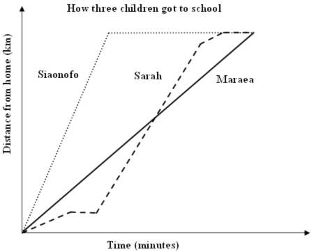
This task is about reading information from a graph.

The graph above shows the different ways three children got to school one day.
Task administration:
This task is completed with pencil and paper or online (with NO automarking).
Levels:
4, 5
Curriculum info:
Key Competencies:
Keywords:
Description of task:
Students interpret a graph about getting to school, writing descriptions about each students journey and making statements comparing the journeys.
Curriculum Links:
Key competencies
This resource involves describing features of a distance-time graph. This relates to the Key Competency: Using language, symbols and text.
For more information https://nzcurriculum.tki.org.nz/Key-competencies
Learning Progression Frameworks
This resource can provide evidence of learning associated with within the Mathematics Learning Progressions Frameworks.
Read more about the Learning Progressions Frameworks.Answers/responses:
| Y8 (05/2006) | ||
|
a) i) |
Correctly mentions all features of Sarah's journey (i.e., walked, stopped, caught the bus, then ran).
Makes 1 error or omits 1 part of Sarah's journey.
Describes Sarah's journey as a mixture of speeds or modes of transport with 2 or more errors or omissions.
|
very difficult
very difficult
moderate
|
| ii) |
A scenario that has Maraea going directly to school at a constant speed.
Mentions Maraea going directly to school or using a single mode of transport but does not mention a constant speed.
NOTE: If part a) i) mentions going up hills or around corners etc, interpret the word "straight" in part ii) as being incorrect as it is referring to going in a straight line (i.e., not turning corners).
|
very difficult
moderate |
|
b) i) & ii)
|
Answers will vary. Statements must compare some feature of either Siaonofo, Sarah, or Maraea's journeys, e.g.,
|
very difficult difficult |
Based on a representative sample of 201 Year 8 students.
Diagnostic and formative information:
Common correct answers
1. In part b), 62 students (nearly one-third) made at least 1 correct comparison and a total of 78 different correct comparisons were given.
2. The most common correct comparisons in part b) follow. These are ordered from the most sophisticated ones that better students made, to less sophisticated ones that more average students made:
- Makes correct comparisons about the relative speed people travelled at. (13% of students)
- Makes correct comparisons about the relative time people took to get to school. (10%)
- Makes correct statements that the people started from or finished at the same place. (10%)
| Common error | Likely misconception | |
|
a) i)
ii) b) i) or ii) |
Describes journeys as being crooked, or going around corners. Describes journeys as being in a straight line rather than a constant speed. Mentions crooked routes to school. | Interprets bends in the graph as bends in the route taken to school. |
| a) i) or ii) | Describes journey as being up a hill. | Interprets slope of the graph as an uphill journey. |
|
a) i)
ii) |
Only mentions one mode of transport or travelling at one constant speed. Describes the journey as a mixture of modes or of the speeds travelled at different parts of the journey. | May have confused Sarah and Maraea's graphs. |
| b) i) or ii) | Makes incorrect comparisons about the speed people are travelling at or the time taken by different people. | |
| b) i) or ii) | Repeats information from the stem of the question or from their answers given in part a). | |
| b) i) or ii) | Makes statements that are not comparisons, or are unrelated to the question. |
Next steps:
If students interpret the slope as bends in the road or as uphill, they need experiences of interpreting the slope of the graph. This could be gained by getting students to do either of the following:
- Plot some graphs of how far people have travelled from a table of values and then discuss the meaning of the slope of the graph.
- Get the students to physically "act out" the journeys in an open space such as a hall or a playground.
NOTE:
- Both algebra and statistics produce graphs similar to the one in this resource. The fundamental difference between the two is that an algebraic graph is based on a rule which gives exact values, whereas statistical graphs are based on data which is intrinsically variable in nature. In real life, most relationships are statistical, but some have such a small amount of variation that they can be used as algebraic for practical purposes.
- Science investigations produce data for statistical graphs, many of which are very close to algebraic in the sense that a smooth curve exactly fits through them (search for graph interpretation in Science).
For resources that look at interpreting different points along graphs of this sort see Hemi's bike trip, Hare's progress, and Climbing the wall.

