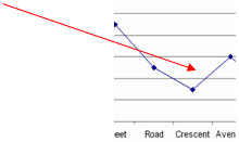
House addresses
0
Overview
Using this Resource
Connecting to the Curriculum
Marking Student Responses
Working with Students
This task is about identifying why a graph may not be suitable to show a given type of data.
Task administration:
This task can be completed with pen and paper or online (with NO auto marking).
Level:
3
Curriculum info:
Key Competencies:
Keywords:
Description of task:
Students decide whether a graph is suitable to display category data and explain their answer.
Curriculum Links:
This resource can be used to help to identify students' understanding of explaining why a data display is inappropriate.
Key competencies
This resource involves explaining why a data display is inappropriate. This relates to the Key Competency: Using language, symbols and text.
For more information see http://nzcurriculum.tki.org.nz/Key-competencies
Learning Progression Frameworks
This resource can provide evidence of learning associated with within the Mathematics Learning Progressions Frameworks.
Read more about the Learning Progressions Frameworks.Answers/responses:
| Y6 (05/2009) | ||
The points should not be joined or an equivalent statement, andan explanation such as:
Crescent and Avenue.

or
|
Full credit
Partial credit
|
very difficult very difficult |
Based on a representative sample of 145 students.
NOTE:
- Some leniency should be applied, i.e., any mention of the points being inappropriately joined should be accepted for partial credit unless there is evidence that other misconceptions are present.
- Talking with the student may help clarify if the student has full or partial understanding of the concept of non-numerical categorical data. Ask them "What is wrong with joining the points?"
- Click on student examples to view some written responses.
Diagnostic and formative information:
| Common error |
|
Missing numbers on y-axis
Students indicate that having numbers 1, 3, 5, 7 & 9 missing from the y-axis is incorrect. (28% of these Year 6 students identified this).
Student identifies that the graph is hard to read This may be related to the above misconception, where having numbers missing from the y-axis makes the graph hard to read. (16% of these Year 6 students identified this) See last of the student examples. |
Next steps:
Missing numbers on y-axis:
- Get students to discuss or debate whether they think it is essential to have all the numbers from 1 to 10 to be present on the y-axis.
- Give them something to plot with large frequencies on the y-axis (e.g., ST8069).
- Get them to find real-life line graphs where there are only some numbers on the y-axis e.g., ST8723). Bring the graphs to a class or group discussion.
Does not know that it is inappropriate to join the points on the graphHave a class or group discussion about what the lines on Olivia's graph mean.
- Ask "Is it OK to join the points like Olivia did?"
- Get those who think it is OK, and those who think it isn't to defend their decision.
- Ask "How many house addresses have 'Street' in them?" It is easy to see there are 9.
- Ask "What kind of address has 7 houses?" — The answer is somewhere between 'Street' and 'Road '. Ask "What is between a 'Street' and 'Road '." Emphasise that there is no meaning to this.
- Get students to discuss and explore different types of data.
Click on Types of data for more information about this.
Student examples (verbatim):
| Student example | Comment |
| The dots are all connected so it means that the number of houses grew then lowered. | The student does not fully elaborate what "the number of houses grew …" means. (May be full credit or partial credit) |
| Because it's like a money graph e.g., Say if I had $100,000 (draws line graph) in three months then I got robbed then it would go down. Because Olivia's Graph is meant to be for progress. | Identifies that line graphs are used in other contexts where the line indicates a steady, continuous change of some sort, for example over time. (May be full credit or partial credit). |
| Because it was a line graph and line graphs don't show the data. | Identifies that a line graph is inappropriate, but doesn't identify the reason. (Partial credit) |
| You can't really tell how many people lived on a road, street because they are joined together with lines. For some people who don't know how to graph very well [they] might not be able to read it because all of the results have been linked. | Identifies that joining the lines is inappropriate, but ascribes this to it making the graph hard to read. This may not be correctly related to the nature of the data, but by the way the axes are drawn. (Partial credit, or no credit if the student's concern relate to the axes alone). |
| Because her graph is very hard to read and because there is no numbers between 0 2 4 6 8 10 and some kids won't understand it. | Does not find an axis with missing numbers acceptable. (No credit) |

