Common words

Common words

Pencil and paper
Overview
Using this Resource
Connecting to the Curriculum
Marking Student Responses
Working with Students
Further Resources
Part I - Individual and pairs work.
a)
Complete this list of what you think are the 20 most commonly used words in English.
Two words have been done for you ("I" and "the").


b)
For each word in your list, count the number of letters it has. 
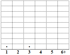
Plot this number on the dot plot below. The words "I" and "the" have been plotted for you.

The words I think are most common

Number of letters in each word

c)
Describe the shape of your graph.
What does this graph show about the length of  words you think are common?  


d)
Compare your graph with one other student's graph. Write their name: ___________________
 
i)  My graph is   similar / different? (Circle one of the words in bold)
 
ii) Explain your answer.  


Part II - Group work.
 
e)
In groups of about four students, produce a graph of all the words that the students in your group had in their list.
Show how many students included each word.


f)
How can you find out the most common words that all the students in your class your class had in their lists?  


Task administration: 
This task requires physical space for students to move around and equipment.
Ensure students know how to record on a dot plot. Model this to the class.
The lesson could be split into two sessions.
  1. Work as individuals and pairs (Part I). At the end of this there is the opportunity for students to compare their own graphs with other students’ graphs. They could be blue-tacked to larger sheets of paper, one under the other. Students could alternatively sort them into piles of similar graphs.
  2. Work in groups (Part II).
Level:
3
Description of task: 
Students conduct a statistical investigation about their prediction of the most common words used in English. They make graphs, describe their shape, and compare their own graph with ones that other students produce.
Curriculum Links: 
This resource can be used to help to identify students' understanding of the statistical enquiry cycle for Statistical investigations.
 
Collecting data: Evidence of students’ ability to record data accurately.
Look for plotting all 20 data points correctly.
 
Describing distribution: Evidence of students’ ability to describe the distribution of different sets of data.
Look for appropriately describing a graph by its overall shape. 
 
Analysis and conclusions: Evidence of students’ ability to compare the distribution of different sets of data. 
Look for appropriately identifying that two distributions are similar or different and gives an explanation based on the overall shape of the graphs.
 
Planning a statistical investigation: Evidence of students’ ability to devise ways of recording data.
Look for describing a plan that will be able to display data, (after a group exercise on data collection and recording).
 
Key competencies
This resource involves:
  • Exploring patterns and relationships in data and dealing with uncertainty, which relate to the Key Competency: Thinking
  • Communicating the findings of an experiment, and explaining variation, which relate to the Key Competency:Using language, symbols and text
  • Working collaboratively and sharing their work with other students, which relates to the Key Competencies: Relating to Others and Participating and Contributing

For more information see http://nzcurriculum.tki.org.nz/Key-competencies

Learning Progression Frameworks
This resource can provide evidence of learning associated with within the Mathematics Learning Progressions Frameworks.
Read more about the Learning Progressions Frameworks.
Answers/responses: 
a)   No credit
b)   20 dots (or the number of words in their list)
c)  
A description about the overall shape, describing most of the points
Examples:
  • The numbers 2, 3 and 4 dominate.
  • Columns 3 and 4 have the most while 1, 2 and 5 have less.
  • The shape starts small but then suddenly increases to a maximum and then starts decreasing.
  • The shape suddenly builds up near the middle.
  • Most of the words have 2 or 3 letters. Less words have 5 and 6 or more. Words with 4 letters are not as common as words with 2 & 3 letters. 
d)
i)
 
ii)
Circles an appropriate option (accept unless there are very clear differences that they do not notice,
or if the two are very similar and they conclude that they are different).
Makes a holistic comparison that describes the overall shape of the graph (rather than focusing on small specific differences).
Examples:
  • Ben’s one is sort of to the right and mine’s in the middle.
  • Saul has more 3 and 4 letter words [and mine has more 5 and 6+].
  • He has put more 6+ words than me, while I tried to use short and simple words we use in everyday life.
  • Because they’re almost completely opposite [One graph was bunched to the right, the other to the left].
  • [Their graph is] really different compared to mine. [Ask them to say why].
    Anecdotal notes can be taken while circulating around the groups.
   
Describes a suitable method for combining the classes or their group’s results. [Prompt students for oral descriptions if they are struggling to write it down.]
Take account of student’s contributions to the groups work as well as their response.
Examples:
  • Make a tellie [tally] chart in your table groups. Count how many you have and write the total at the bottom of each word.
  • Make a list and get everyone to write their name under the word then count how much people in each word and make a chart.
  • Draw a graph to show how much people wrote down the words. You just write the word down first then draw the graph. 
Based on sample of 10 Year 6 students
Teaching and learning: 
This resource is about:
  1. the distribution of graphs. This is the overall shape of the graph. For this data, this generally involves seeing where most of the data is located rather than individual, specific features such as the mode, median etc. The mode is just the most common single category, and will usually have far fewer than half of the data points. One effective strategy is to encourage students to put a circle around where most of the data lies (at least a half, and preferably two-thirds or more).
  2. the students’ ability to record data accurately [part c)] and to devise ways to record data [parts e) and f)]. 
Diagnostic and formative information: 
  Common response
c)
Gives a simple descriptor of their graph with insufficient information
Students describe the shape, likening it to a physical shape (for example, tall buildings) without clearly identifying how that shape is applicable.
Examples:
  • [It] looks like buildings.
  • The graph looks like a tower.
  • The shape is like a sheep. [This student then noted where most of the data points lay].
c)
Gives individual features of their graph to describe the distribution
Students give specific features of the graph, and often list the actual frequency of each bar in the dot plot.
Examples:
  • Not many twos, 2 ones; 4 fours. There are 7 fives and 4 sixes and over.
  • There are [exactly] the same amount of words in 3-4.
  • There are 7 fives and 4 sixes and over. They are about 5 letters long [overall]. 
d)
Gives individual features of their graph to decide if two graphs differ
Examples:
  • Most of her words have 3 letters. My graph shows that most common words have 2 letters.
  • Because Don’s is highest at 2 letters and mine is highest at 4 letters.
  • Hannah has more 3 letter words.
 
See Sudent work examples [pdf] to view some students’ graphs.
Next steps: 
Gives a simple descriptor of their graph with insufficient information
Encourage students to give descriptions of the graphs that have information about where most of the data points lie. If they write “It looks like tall buildings”, then ask them to describe the heights of some of the individual ‘buildings’. This could be followed by a question such as “Show me where most of the tall buildings are (stressing you want more than one building).”
 
Gives individual features of their graph to describe the distribution
Encourage students to look at a graph as a whole rather than discussing individual, specific features of them (e,g., the mode or the maximum value). One way to do this is to ask the students to put a circle around most of their points. Their circles should include at least half of the points, and preferably two-thirds or more. This could be referred to as “the biggest chunk” of the data. Students need to see that this is a different question than “Put a circle around the most common category [the mode].” Students could be asked to describe their graphs again after circling where most points lie.
 
Gives individual features of their graph to decide if two graphs differ
Again, encourage students to look at a graph as a whole rather than discussing individual features of them. They should put a circle around where most of the points on the graph are, and then use this to help them compare the two graphs. Once again “most” refers to a group of categories where over half the points lie, not to the most common category (i.e., the mode). Click on the link Student work samples [pdf] for some examples of students’ graphs, where some circles have been drawn to demonstrate how these could help students decide if their graphs are reasonably similar or different. The maths resource People and their pets (ST8765) assesses comparing two similar distributions.
Figure it out
For resources that look at the distribution (shape) of graphs visually:
Population pyramid (Statistic, Book 2 L4, p.10); and
Uniform changes (Statistics, L3–4, p.2), particularly the first graph.