Letters to houses
0
Overview
Using this Resource
Connecting to the Curriculum
Marking Student Responses
Working with Students
Further Resources
This task is about graphing data of two variables and looking for patterns.
Patrick wants to know if there is a relationship between the number of people at a house and the number of letters delivered to the house. He collects data for 18 houses and puts it in a table.
Number of people per house and the number of letters delivered
| Number of people at a house | 1 | 1 | 2 | 2 | 2 | 3 | 3 | 3 | 3 | 4 | 4 | 4 | 4 | 5 | 5 | 5 | 6 | 6 |
|
Number of letters |
6 |
8 |
7 |
8 |
9 |
8 |
9 |
11 |
12 |
9 |
11 |
14 |
15 |
14 |
16 |
17 |
15 |
19 |
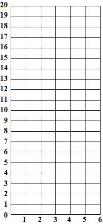
| a) | Draw a scatterplot or any other graph of the data he collected (shown in the table above). |
|
Number of letters delivered to the house
|
|
| b) |
Describe the relationship you can see in the graph between the number of people at a house and the number of letters delivered to the house.
|
Task administration:
This task is completed with pencil and paper only
Level:
4
Curriculum info:
Key Competencies:
Keywords:
Description of task:
Students draw a scatterplot of a table of data and describe the relationship between the two variables.
Curriculum Links:
This resource can be used to help to identify students' understanding of statistical investigations:
- Displaying multivariate whole-number data: plotting a graph that shows the overall trend as well as the variation in the data
- Interpreting results in context: describing the general trend of a bivariate relationship, acknowledging that this varies for individual houses
Key competencies
This resource involves exploring and using patterns and relationships in data and communicating findings. These relate to the Key Competencies: Thinking and Using language, symbols and text.
For more information, see https://nzcurriculum.tki.org.nz/Key-competencies
See Student work samples [pdf] for a range of measurement strategies that students' used.
Learning Progression Frameworks
This resource can provide evidence of learning associated with within the Mathematics Learning Progressions Frameworks.
Read more about the Learning Progressions Frameworks.Answers/responses:
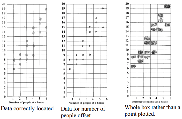
| a) |
Draws any 1 of (moderate) :

NOTE: All three responses were done by students of high mean ability and received full credit.
Partial credit (easy)for any 1 of:
|
| b) |
Any 1 of the following descriptions:
Describes the general trend of the relationship, acknowledging statistical variation (very difficult), e.g.:
Describes the general trend of the relationship (very difficult)
Describes trend holistically e.g.:
Compares the houses with few people (1-2) with those with many (5-6), e.g.;
Describes how the maximum, minimum, or average number of letters goes up in a specific way as the number of people at a house increases.
Describes the rate of number of letters each person receives (very difficult), e.g.:
|
Based on a representative sample of 191 Y8 students, October 2010
Teaching and learning:
This resource is about responding to the relationship between two variables, the number of people at a house, and the total number of letter that they receive. Analysing multivariate data (of which bi-variate examples like this are the simplest) has only moved down to Levels 3 and 4 in the 2007 curriculum. Variation is one of the big ideas of statistics. A statistical trend has variation about it whereas an algebraic relationship is exact.
Diagnostic and formative information:
| Common response | |
| a) |
Inappropriate graphics or tabulations (click on Student work samples [pdf] for examples)
|
| b) |
Cannot spot the overall trend
Comments on the number of letters only
Attempts to describe an exact (algebraic) pattern
|
Next steps:
Comments on the number of letters only
Ask these students orally, "Is there a connection or link between the number of letters delivered to a house and the number of people at a house?" If they can answer this satisfactorily, then it may just be a reading comprehension issue. If they still cannot answer the query, then they cannot spot the overall trend (see below).
Students need to develop skills in looking at the relationship between two variables. This could be done by constructing or interpreting time-series graphs and seeing how the graph changes over time (Use the keyword, times-series). They could also look at some simple bi-variate relationships, where one variable only has two categories. See the resource Assignment marks (ST8083).
Cannot spot the overall trend
Students who drew a reasonable graph of the data were far more likely to describe the trend than students who did not draw a graph relating the two data sets. One resource which demonstrates how to plot one variable against another is How hungry? (AL6063). While this is an algebraic graph, it could be adapted to be a statistical one. The plot could be of a number of students each of whom are not exactly as hungry as each other, and the task is to look for common features of the whole set of students. Students could plot the height and the weight of all students in their class and discuss the graph.
Attempts to describe an exact (algebraic) pattern
Students need to understand that a statistical relationship has variation in it, while an algebraic relationship is exact. For example there is an exact relationship between the number of people and the number of legs they have (assuming all have two legs each). However students of the same height may have a different weight. The relationship between height and weight is not exact but displays variation. Discuss these and other examples with students.
For other ARB resources that explore the relationship between two variables use the keyword, bi-variate data.
Figure it out
- Keep your shirt on, (Financial literacy: Young Entrepreneurs page 9).
- Swing time, (Forces: Mathematics in science contexts page 16). This activity is better than Flying High on page 4 of the same book. The latter would be improved by plotting all points measured rather than just the average, as this displays the statistical variation. And why not repeat it a few more times at each height? The median point could then be used to help show the overall trend and the individual points show the variation. Both trend and variation should be discussed.


